Your Messages, Phone, and Contacts icons are about to look different
Google's gradient makeover continues
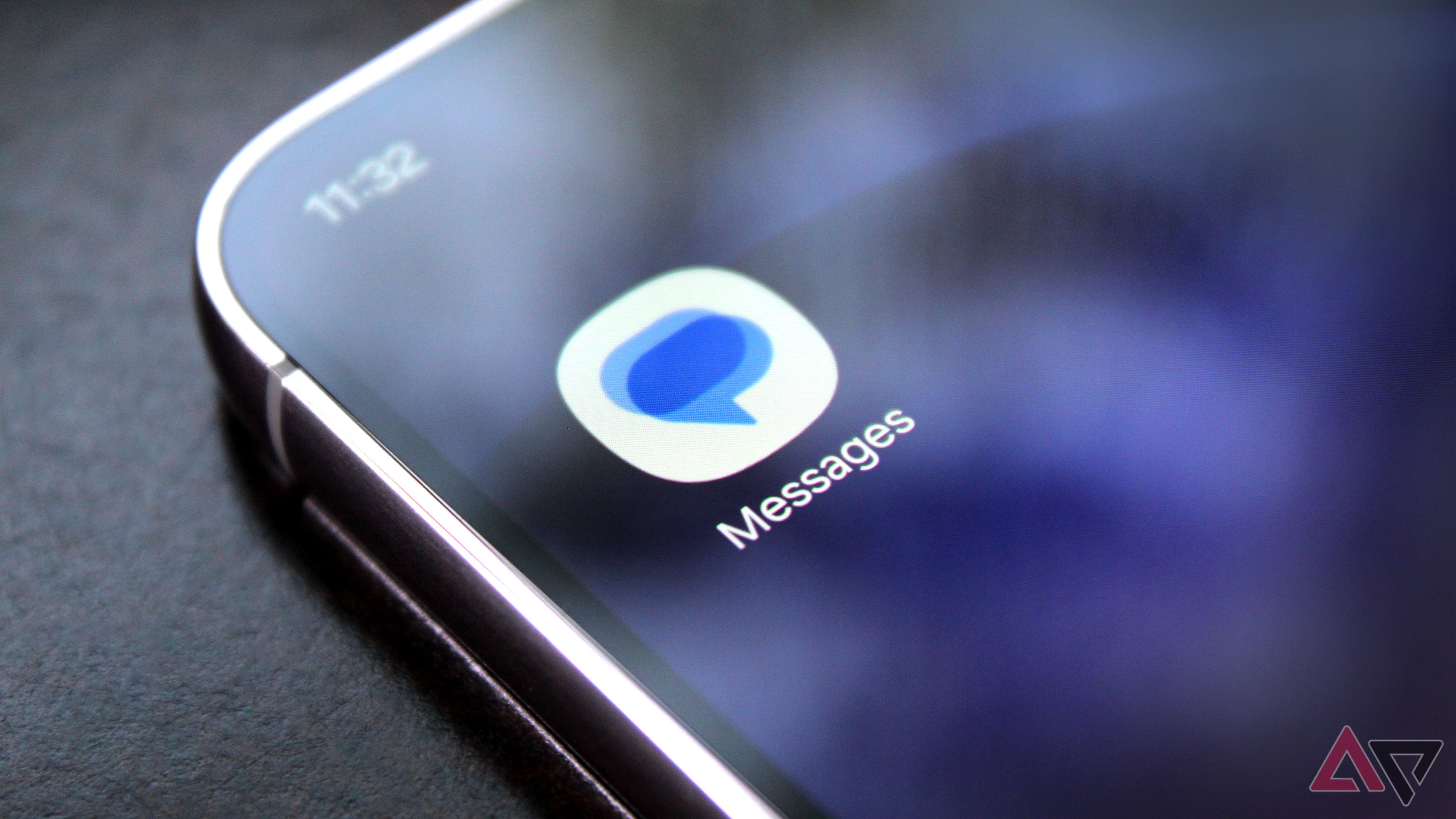
Google is set to introduce new app icons for its Google Messages, Phone, and Contacts apps on Android devices. Last year, Google unveiled its new gradient logo design, signaling its pivot towards an AI-driven future. This year, Google applied a similar design approach to its Workspace suite, which comprises Gmail, Drive, Docs, Calendar, and more.
Now, the tech giant is extending this aesthetic upgrade to some of Android's most frequently used applications. Google has announced the upcoming rollout of redesigned icons for its core Android applications: Google Messages, Phone, and Contacts. These refreshed icons will feature the same gradient effect observed in other Google apps recently.
While the overall appearance of these icons might not be radically different from their predecessors, there are subtle alterations in color and design. Google aims to enhance the clarity and sharpness of these icons on users' home screens. The company has incorporated subtle gradients with more prominent edges, along with adjustments to the curvature and colors, in order to align better with Google's updated design language.
It's worth noting that these alterations are purely cosmetic and do not impact the functionality of Messages, Phone, and Contacts. Users will continue to have access to the same apps and features they have become accustomed to. The new icon designs are gradually being rolled out to Android devices, and although they haven't been spotted on the author's Pixel 11 Pro yet, the rollout is now in progress. Users should begin noticing the updated icons on their Android phones within the coming days.
Written by urgent.news from Android Police's reporting — not their text. Machine-written — may contain errors; check the original before relying on it.