Google rolling out gradient icon redesigns for Contacts, Messages, and Phone
Following the Workspace and Pixel app redesigns earlier this year, Google is overhauling the Contacts, Messages, and Phone icons. more…
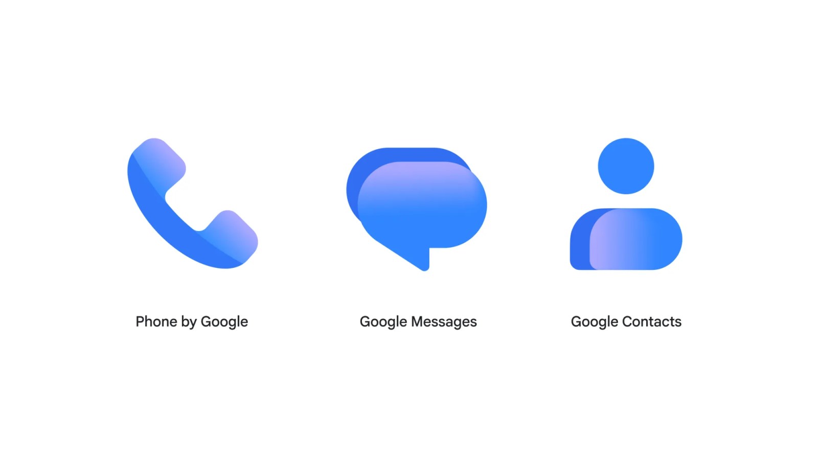
Google is set to introduce redesigned gradient icons for its Contacts, Messages, and Phone apps, as part of a broader revamp following earlier modifications to Workspace and Pixel apps. The updated icons boast sharper clarity and a subtle gradient, allowing for easily discernible edges, while maintaining the same general shapes of the communication apps.
These enhancements aim to unify the look with other Google apps, rolling out gradually through the Play Store. The modifications are already visible in the latest Google Messages beta available today. Google reassures users that no functional changes will occur with these updates, as the apps' functionalities remain unchanged. The sleeker appearance will be evident on users' home screens over the following weeks, and the new designs will also be applied to the websites contacts.google.com and messages.google.com/web. For additional updates, viewers can tune into 9to5Google on YouTube.
Written by urgent.news from 9to5Google's reporting — not their text. Machine-written — may contain errors; check the original before relying on it.
This story
This is one outlet's version. Read the fullest account.
- Google Pixel 11 Pro gets a $300 Amazon discount to $799 androidauthority.com
- Google Messages update rolling out new app icon with gradient design 9to5google.com
- Google Messages, Phone by Google, and Google Contacts get new, updated icons. blog.google