I changed 5 Android display settings to reduce eye strain while reading mobile articles
I fixed my phone's worst reading annoyances
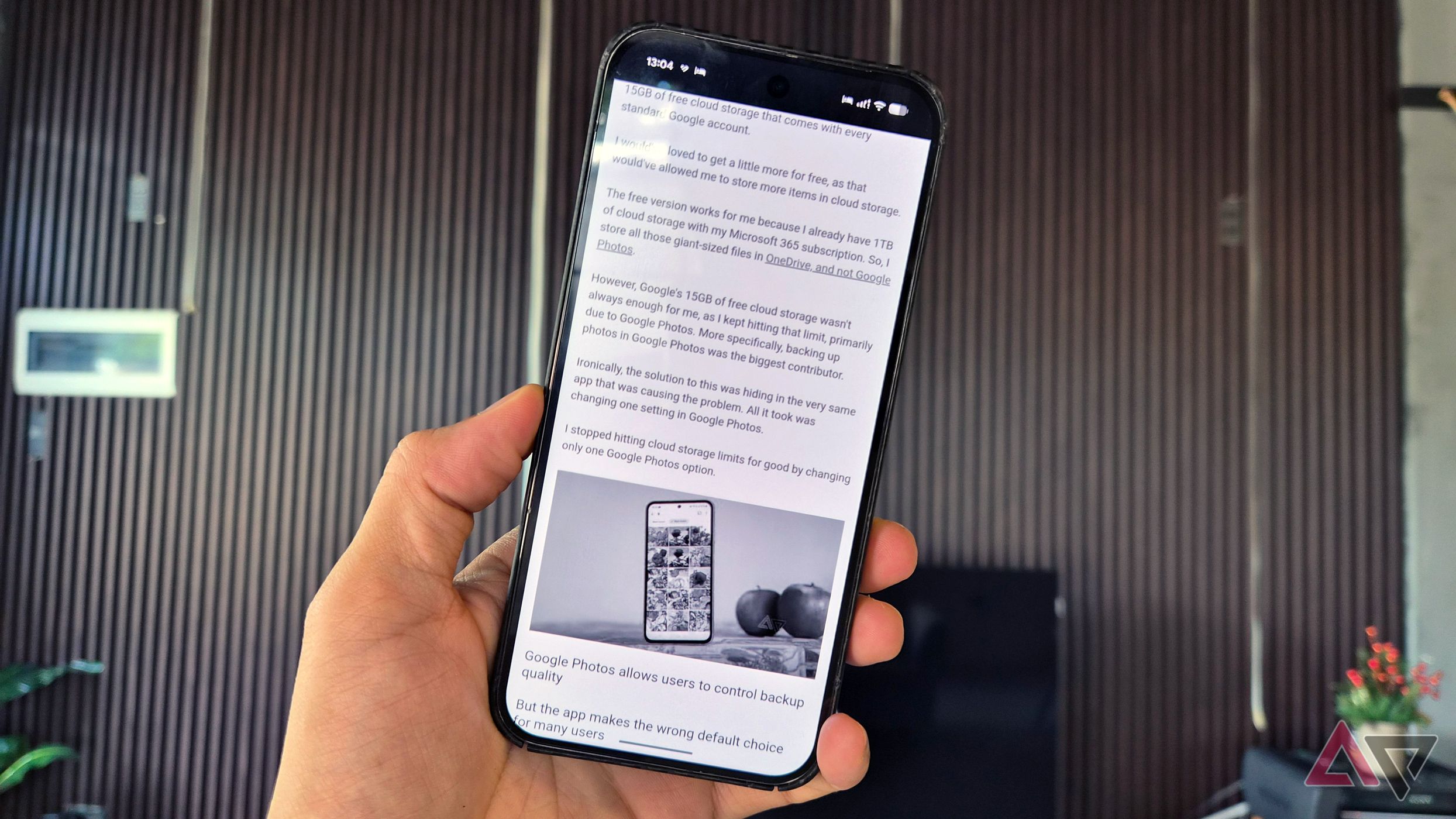
I learned about several small Android display settings that significantly reduce eye strain when reading lengthy articles on my phone. One of the most noticeable improvements came from increasing the text size. Phones often come with small default fonts that make long passages difficult to read. By enlarging the font, even by a modest amount, reading became less tiring and more comfortable.
Text size can usually be adjusted in the same settings where the default font size is changed, but keep in mind that some apps may not respect the system-wide changes.
Adjusting the display size also helped. This feature changes the scaling of screen elements, including buttons and menus. Most apps adhere to the system font size, but a few use fixed layouts or their own text controls, so the benefits may not be as pronounced everywhere. Nonetheless, for typical activities like browsing websites, checking messages, and using most apps, bigger text made a clear difference.
Another setting that made a big difference was switching to a warmer screen tone. Phones typically use a cool color temperature that gives the display a bluish tint, which can be uncomfortable during extended reading sessions. Warmer tones, such as a slight yellow or amber hue, make text feel easier on the eyes, particularly in low-light conditions.
This can be enabled through the Eye Comfort or Night Light feature, which can also be scheduled to activate automatically in the evening and deactivate in the morning. Although it might appear unusual at first, the warmer tone eventually feels more natural and comfortable.
Dark mode is another effective adjustment. Instead of the usual white background with black text, dark mode presents light text on a dark backdrop. This reduces eye fatigue, especially in low-light environments. Some reading apps provide sepia backgrounds, which simulate the warm tone of paper and can be particularly pleasant during daytime reading. The ideal mode depends on the lighting conditions: dark mode works well at night, while sepia or slightly off-white backgrounds are better suited for daytime use.
Locking the screen orientation was another minor change that made a difference. Phones often automatically rotate the screen when tilted, causing pages to reload or shift and disrupting reading progress. By disabling automatic rotation, the screen remains fixed in portrait orientation, maintaining the layout and preventing accidental changes while holding the phone. This ensures a more stable reading experience.
Finally, screen brightness played a crucial role in comfort while reading. An overly bright screen can create glare and cause eye strain, while a dim screen may necessitate squinting or moving the phone closer to the face. Finding the optimal brightness level varies with the surrounding environment. In bright daylight, higher brightness may be necessary, whereas lower brightness feels more comfortable in dim settings.
Many Android devices offer Adaptive brightness, which automatically adjusts the screen based on ambient lighting. However, manually adjusting the brightness occasionally enhances the reading experience, particularly in the evening when a slightly dimmer screen feels more soothing.
Written by urgent.news from Android Police's reporting — not their text. Machine-written — may contain errors; check the original before relying on it.