‘I wanted it to be raw’: Paula Scher explains her squished map logo
Women+ on the Edge of Democracy is an upcoming revue of 10-minute plays and monologues about this moment in democracy, as written by 36 women playwrights. The logo for initiative, designed by Pentagram partner Paula Scher, with associate partner Bruno Bergallo and project manager Olivia Ray, purposely squeezes its title into a tight frame to visualize a point. Scher tells Fast Company that…
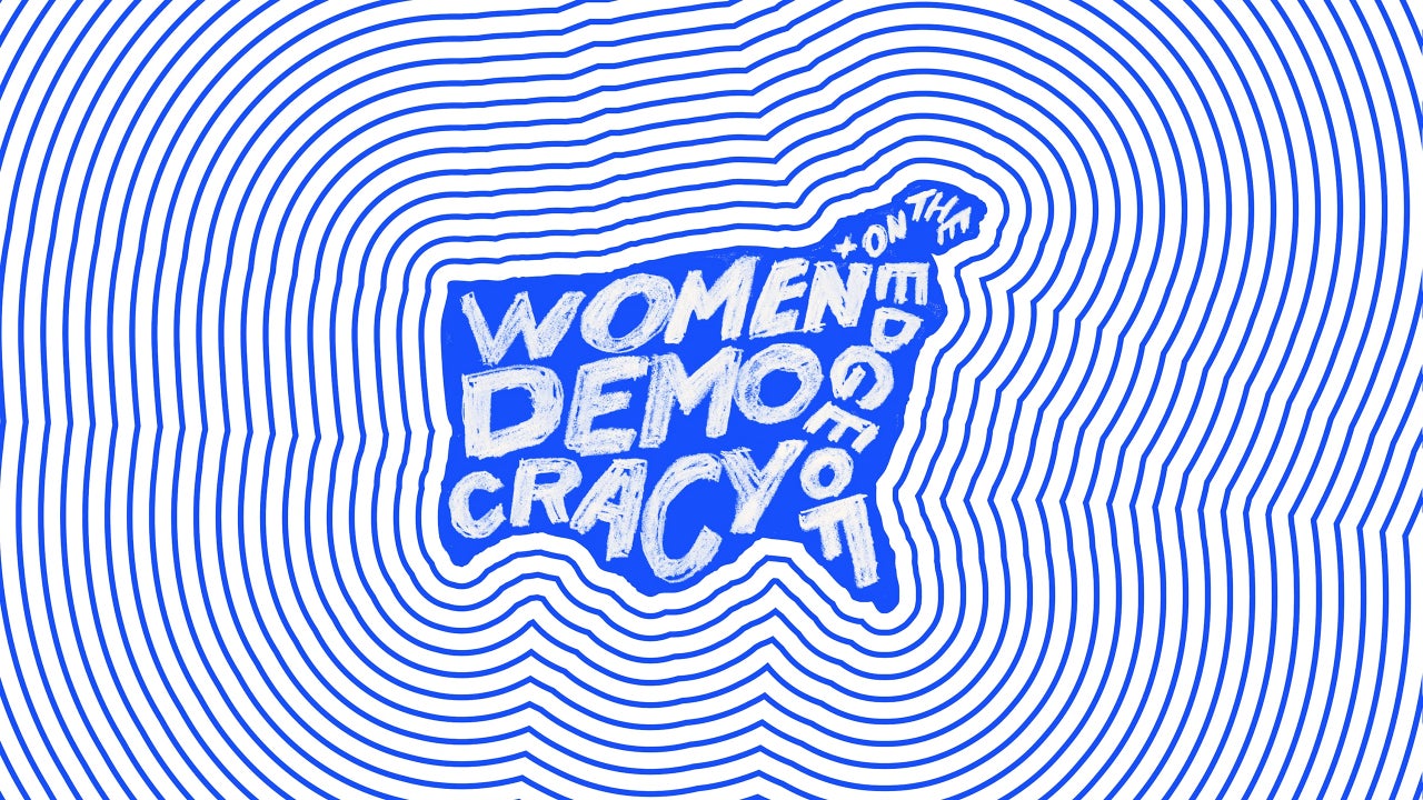
Women+ on the Edge of Democracy is a showcase of 10-minute plays and monologues written by 36 women playwrights. The logo, created by Pentagram partner Paula Scher, reflects the theme of women being squeezed out of democracy. Scher explains her choice to create a cramped, handwritten logo because she wanted it to be raw and not sophisticated.
The logo visually represents the title within a tight frame, appearing roughly shaped, as if made from tears on a sheet of paper. The title is split across two rows without a hyphen, with "Women" on top, "Democracy" split, and "+ on the Edge of" scribbled along the East coast. Despite some attempts with traditional typography, Scher felt that the final, scribbled lettering had the most impact.
The revue will be performed on October 23 and 24 at the Flynn Center for the Performing Arts in Burlington, Vermont, and organizers are inviting local performances of the plays.
Written by urgent.news from Fast Company's reporting — not their text. Machine-written — may contain errors; check the original before relying on it.