What different world maps get right - and what they get wrong
As the UN adopts a new world map to reflect Africa's true size, let's take a closer look at what different maps get right and wrong.
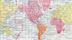
The United Nations has called for the widespread use of a world map that more accurately reflects the true size of continents, such as Africa. The current Mercator map, which has been in use for over 450 years, disproportionately represents landmasses. For example, Africa appears to be of similar size to Greenland on the Mercator projection, despite being about 14 times larger.
This distortion, while useful for navigation, has led to a psychological effect where some places seem more important than they actually are. Critics argue that this impacts how regions are perceived politically and economically.
To address this issue, the UN adopted the Equal Earth projection in 2018. This map aims to provide a more accurate representation of landmasses' sizes and shapes. However, it sacrifices the straight lines that made the Mercator map ideal for navigation, and it cannot be used for measuring precise distances. Other maps, like the Peters world map, sacrifice accuracy of shape for accuracy of scale, allowing users to grasp the comparative sizes of landmasses.
Yet, this map also distorts the shapes of Earth's landmasses. Various other mapping techniques, such as the Azimuthal equidistant projection, place regions at proportionally correct distances from a single point, though they are not suitable for navigation and have their own sets of distortions.
Written by urgent.news from BBC World's reporting — not their text. Machine-written — may contain errors; check the original before relying on it.