How AIDS Activists Turned Graphic Design Into a Weapon
In the 1980s, a band of fed-up young men wheat-pasted New York with graphically stark flyers, posters, and stickers, demanding action.
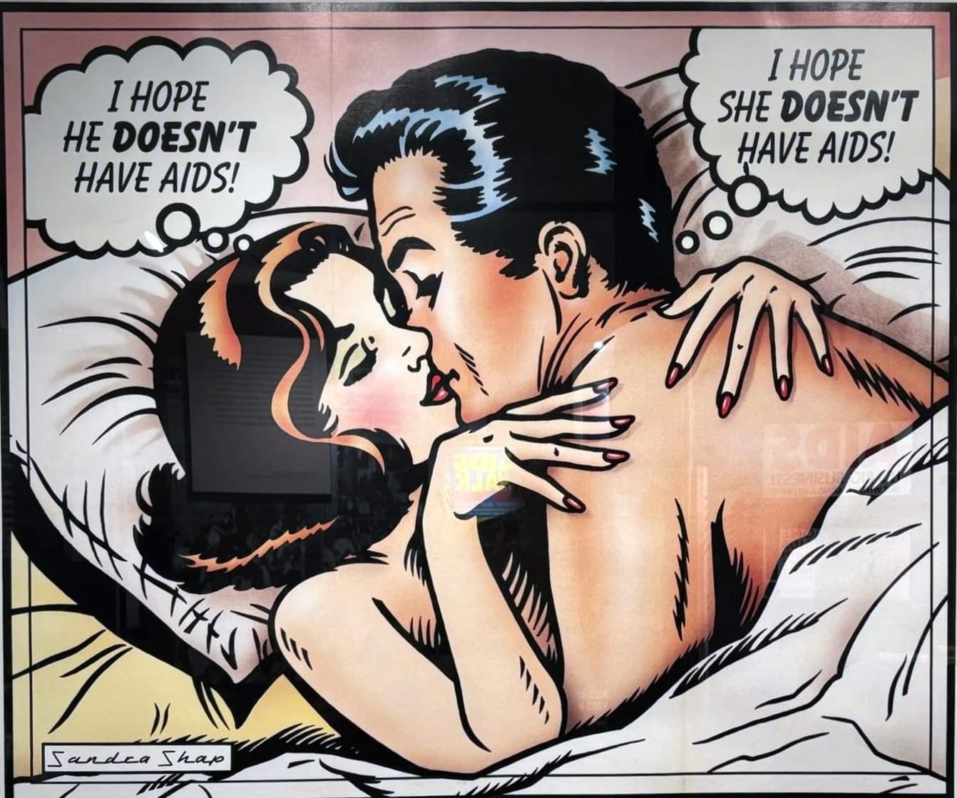
In the mid-1980s, as the AIDS crisis continued to intensify in the apartments and bathhouses of New York, a group of anxious and frustrated young men turned to copy shops for a solution. They had witnessed friends, partners, and loved ones succumb to a mysterious illness, which was initially dubbed the "Gay Plague." These individuals recognized the potential impact of visual media and decided to take matters into their own hands, securing jobs at Kinko's to secretly operate the printers after hours.
Their clandestine efforts resulted in the production of stark, boldly colored flyers, posters, and stickers – essentially a public relations toolkit.
Ironically, the corporate America that was largely indifferent to the plight of the afflicted unknowingly aided these activists by providing the necessary resources for their cause. The artists and designers behind these creations sought to challenge the media gatekeepers and craft visually compelling imagery that could resonate with the general public while amplifying their numbers.
Ian Bradley-Perrin, curator of Love and Fury: New York’s Fight Against AIDS at Poster House in Chelsea, highlights their strategic approach. He explains, "Those activists figured out who the gatekeepers in the media were. They imagined how we can create visuals and images that will grow our numbers but also speak to the general public."
The exhibition at Poster House is divided into four sections, each offering a unique perspective on the AIDS activist movement. The first part delves into the early grassroots efforts aimed at educating and promoting safe sex practices. As one moves through the exhibit, the focus shifts to action-oriented designs and colors, primarily produced by agitprop groups such as the AIDS Coalition to Unleash Power (ACT UP) and Gran Fury.
These groups were determined to combat political inaction and advocate for equal access to healthcare. The final two sections, "The Power of Design" and "The City that Danced for its Life," delve into the tactics employed to mainstream activism, thereby generating funds, cultivating a vibrant gala culture, and even injecting a sense of joy into the fight against the disease.
Among the most iconic pieces in the exhibition is "Silence = Death," a design created by a group striving for maximum impact. The image features a stark black background with a central pink triangle, originally utilized by Nazi prison guards to mark LGBTQ+ prisoners. This powerful visual choice evokes a sense of urgency and impending doom.
Keith Haring further expanded on this message with his widely recognized "Ignorance = Fear" poster. The artwork showcases three bold-lined figures with crossed-out stomachs and raised fists, set against the backdrop of New York's iconic neon orange and cobalt blue color scheme. The inclusion of these two seminal posters in the showcase emphasizes the crucial role that graphic design played in shaping the AIDS activist movement, without which the narrative of this pivotal time in history would lack essential context.
Written by urgent.news from Hyperallergic's reporting — not their text. Machine-written — may contain errors; check the original before relying on it.