New gradient icons roll out to Google Messages & Contacts
Google this week completed the rollout of its new gradient icons with updates for Messages and Contacts. more…
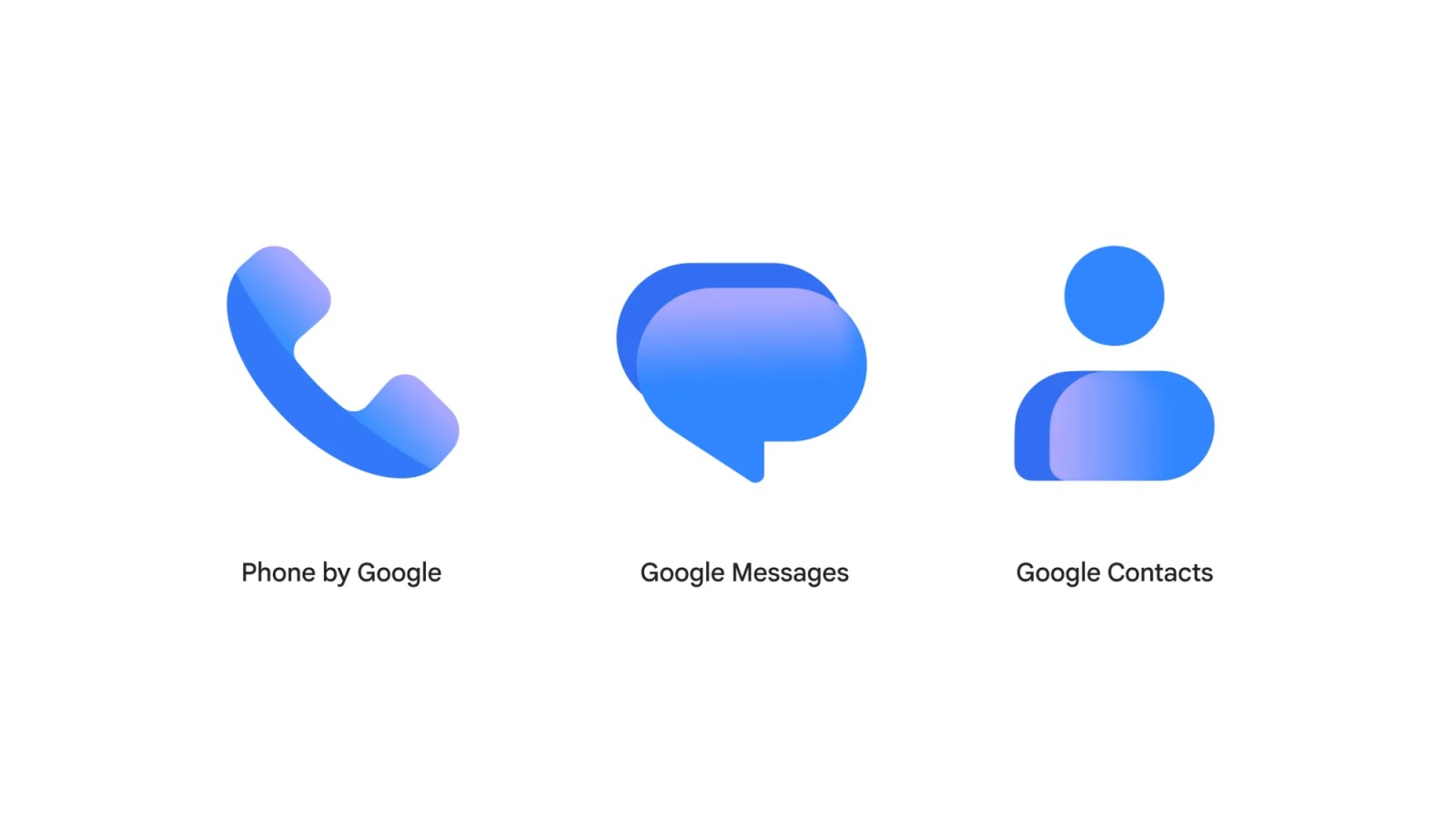
Google has recently finished rolling out its new gradient icons across Messages and Contacts apps. Though the shapes remain unchanged, these icons are larger and better fit the circular backgrounds. Contacts is represented as a head and body, while Messages maintains its overlapping chat bubbles and Phone displays a handset. This update is relatively unobtrusive, employing a lighter shade of blue and incorporating a gradient effect, giving the logos a sleeker, more contemporary appearance.
Google refers to the updated Messages icon as "sharper, crisper, and clearer than ever before." The SMS/RCS client did not undergo any additional alterations alongside the logo redesign. The homepage redesign is still in beta mode. Google Contacts was the final Android icon to receive a refresh, with version 4.92.26.x released on Wednesday evening.
The Phone by Google update was rolled out on Monday to stable users, taking two weeks from announcement to complete availability across all three apps. For further updates, viewers can check out 9to5Google on YouTube.
Written by urgent.news from 9to5Google's reporting — not their text. Machine-written — may contain errors; check the original before relying on it.
This story
This is one outlet's version. Read the fullest account.
- Survey shows two-thirds of readers like Google Messages’ pinned chats redesign androidauthority.com