Arsenal’s new blackletter font is a tribute to a star player
Arsenal’s new gothic font is a modern take on black letter. It’s part of a larger multi-font branding strategy for the 140-year-old English football club. The team unveiled its new font, Rocastle, at a pop-up exhibition this month at the Design Museum , in London. It’s named for the beloved late Arsenal player David Rocastle (1967–2001), also known as Rocky, and was created by David Rudnick,…
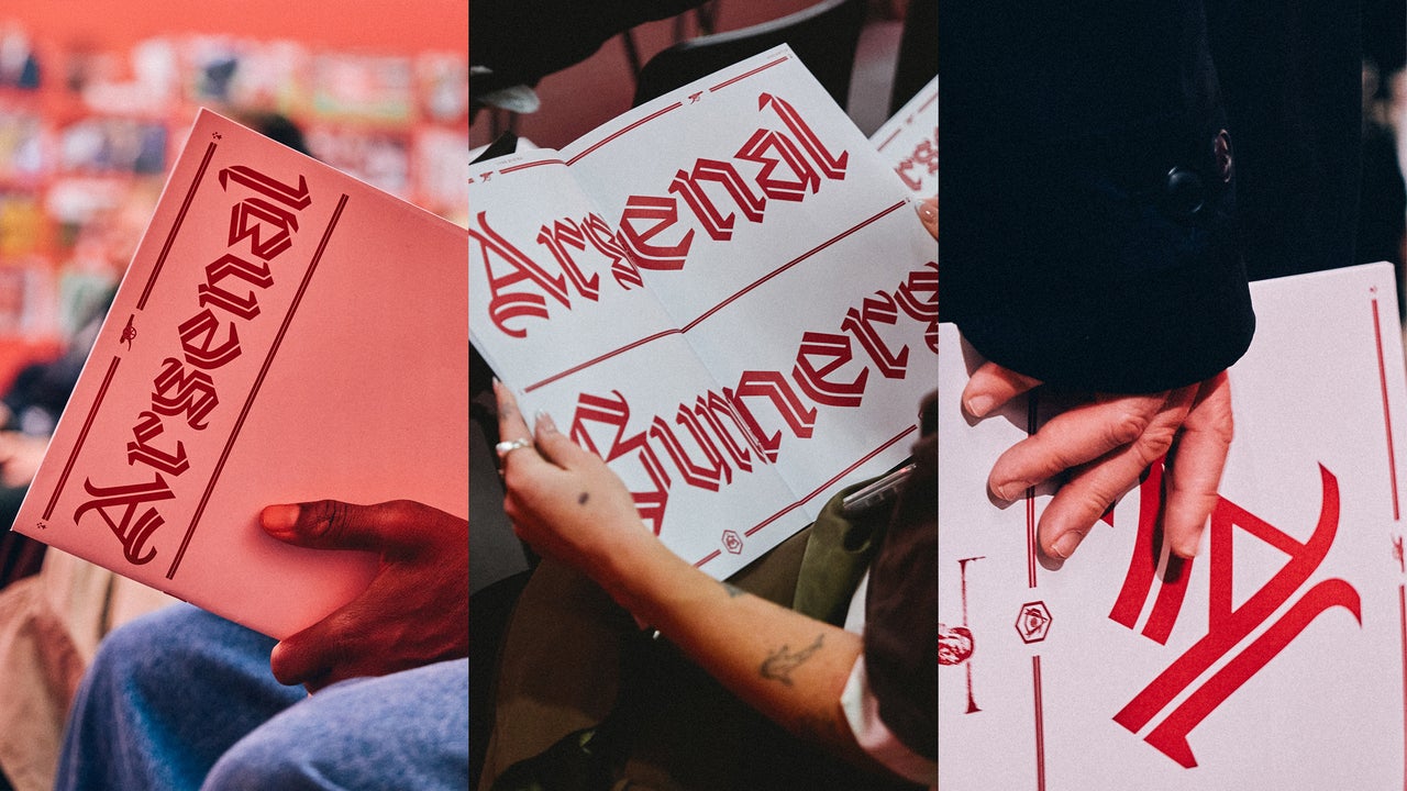
Arsenal has unveiled a new blackletter font, Rocastle, to honor the late player David Rocastle, known as Rocky. The font is part of the club's multi-font branding strategy for its 140-year history. Rocastle is named after the beloved former Arsenal player and was designed by David Rudnick, the founder of terrain studio, in collaboration with Léa Bruneau.
Rudnick, an Arsenal fan, aimed to create a font that is distinctly English and tailored to the team. The design combines traditional blackletter elements with modern aesthetics, making it both bold and legible. Arsenal began updating its typography in 2022, and Rocastle is the first font representing the club's "culture" pillar.
The font is inspired by the lettering in the club's VCC crest, which stands for "Victoria Concordia Crescit" or "victory grows through harmony." Rocastle is a contemporary yet heritage-inspired font that would work well in various contexts, from fashion drops to design museum exhibitions. While some online commenters have criticized its legibility, Arsenal's creative studio lead, Johnnie Campbell, emphasizes that it is meant for special moments and creative collaborations, allowing the club to stay true to its heritage while looking forward to the future.
Written by urgent.news from Fast Company's reporting — not their text. Machine-written — may contain errors; check the original before relying on it.