U.N. recommends Equal Earth map to show world in truer proportions — NV infographic
On Sept. 4, 2026, the United Nations adopted a resolution recommending broader use of the new Equal Earth map, which more accurately represents the relative sizes of different parts of the world. In particular, it corrects the proportions of Africa relative to several countries and geographic regions in the Northern Hemisphere, including Russia’s exaggerated size.
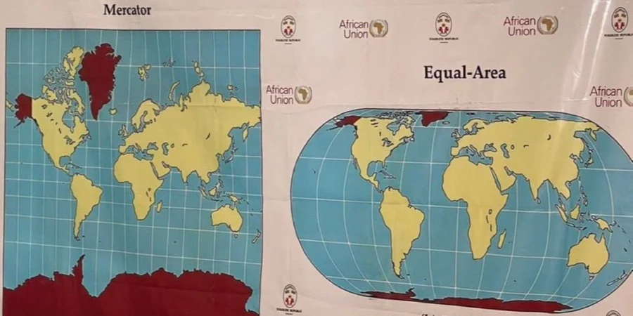
On September 4, 2026, the United Nations passed a resolution advocating for the increased use of the Equal Earth map to more accurately depict the sizes of various global regions. This map specifically addresses the disproportionate representation of Africa in relation to several Northern Hemisphere countries, such as Russia, whose size was historically overstated.
The objective of the Equal Earth map is to diminish geographical inaccuracies found in educational resources, public communications, and data visualizations. While the resolution recommended the adoption of the new map, it did not enforce its use. The Equal Earth map quickly ignited discussions regarding the issues with the traditional Mercator projection, which the U.N. map aims to correct.
A notable issue with the Equal Earth map is its depiction of temporarily occupied Crimea as a separate entity from Ukraine, which led to Ukraine abstaining from the vote on incorporating the new map into their practices. On this map, Crimea is displayed in a lighter shade compared to Ukraine and distinct from Russia. Similarly, territories of other nations occupied by Russia, including Georgia and Moldova, lack a designated color.
The NV infographic explains and visually contrasts the differences between the Mercator projection and the Equal Earth map. The latter preserves angles and straight bearings for easier navigation, while the former minimizes area distortion near the equator and amplifies it at the poles. Under the Mercator projection, Africa and Greenland seem to be of similar sizes, whereas the continent is actually 14 times larger than the island.
Moreover, Australia appears around 10% smaller than its actual size, while Canada and Russia seem disproportionately larger. This map successfully represents the true proportions of areas but alters shapes, angles, and distances, making it unsuitable for navigation or distance measurements. The Equal Earth map comes in several versions, each centered on the Greenwich meridian, the Americas, or Oceania.
Areas such as Africa, Australia, South America, South Asia, and Oceania appear larger in this projection, while North America, Russia, and Northern Europe appear smaller than in the Mercator projection.
Written by urgent.news from New Voice of Ukraine's reporting — not their text. Machine-written — may contain errors; check the original before relying on it.