Building Isolyne (Part 7): Designing Dark Mode for High-Velocity Dev Teams
Isolyne replaces scattered styling decisions with centralized React Native tokens for color, elevation, spacing, typography, radius, motion, and interaction. The same primitives also keep its core interface and RevenueCat paywall visually consistent.
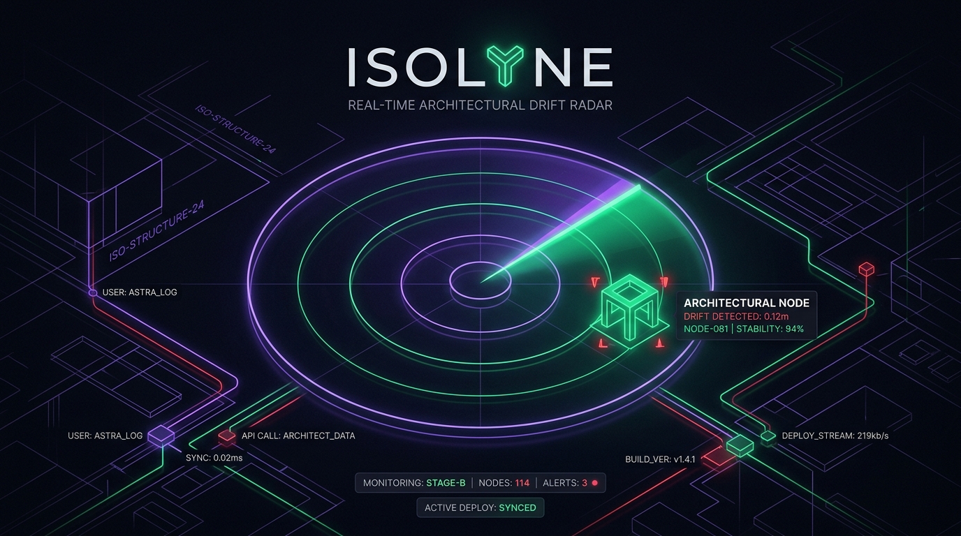
In Part 7 of the Building Isolyne series, the focus is on designing a dark mode visual hierarchy for high-velocity development teams competing in the Shipaton 2026 Design Award. To avoid the common pitfalls of prototype applications, the team implemented a strict, tokenized design system before any screen was coded. This included an Obsidian Base Palette consisting of deep indigo-black (#07080F) for background elements and various shades of gray (#0C0E16, #1E2130) for structural lines and text hierarchy.
The team also established a geometric 4px-grid spacing scale and a typographic hierarchy that optimizes quick scanning for high-pressure collaborative environments. To provide tactile feedback, a custom AnimatedPressable component with spring physics was implemented, ensuring that interactive elements feel responsive under the user's touch.
Accessibility was prioritized by ensuring that color-coded elements are never the sole means of conveying information, with alternative visual cues like icons and aria-labels used in conjunction with color. This approach enables Isolyne to seamlessly integrate a RevenueCat Pro Paywall into its design system, reinforcing trust and enhancing user experience through cohesive visual elements.
Written by urgent.news from HackerNoon's reporting — not their text. Machine-written — may contain errors; check the original before relying on it.