World Maps Might Soon Get an Upgrade. The United Nations Votes to Endorse Global Charts That Better Represent Africa's True Size
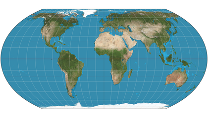
The most widely used global map is almost 500 years old and was designed for navigation. But landmasses near the poles look larger than their actual relative sizes, and those near the equator look much smaller
We haven't written up this one. Smithsonian has the full story — the link below goes straight to it.