Google Clock’s new timer UI is here, and your muscle memory won’t like it
Google Clock's Timers tab just got a big makeover.
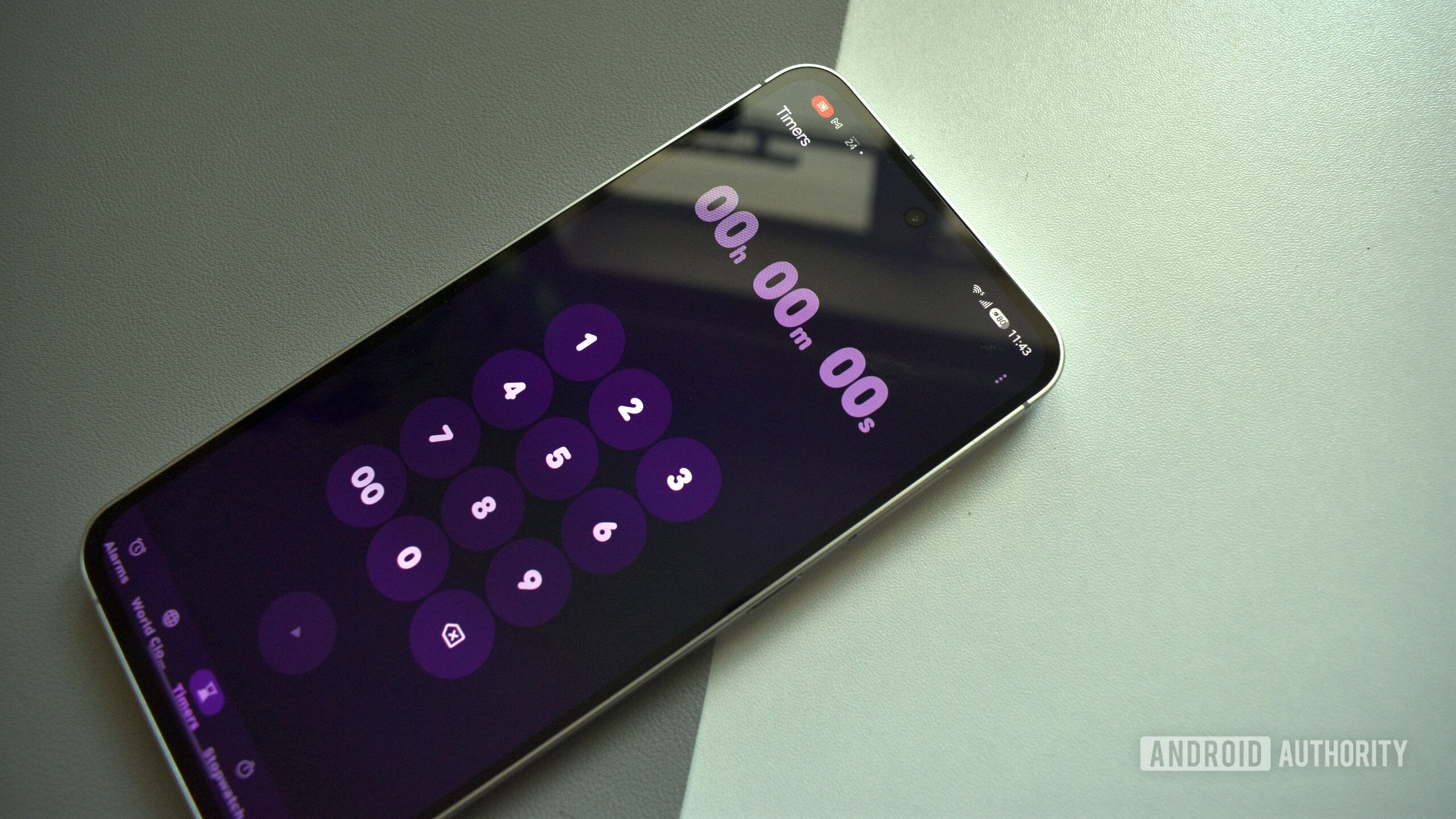
Google has introduced a new timer interface in the Clock app, which may prove disconcerting for users accustomed to the existing design. The interface features flatter numbers that lack the circular background that previously housed them. Moreover, there are preset options for timers of 1, 5, 10, and 15 minutes. The start button has been relocated as part of these changes.
When multiple timers are active, they are displayed within a grid format. This is a departure from the previous setup where the timers were stacked vertically within a single card. This new layout allows for a more efficient use of screen space, making it easier for users to manage multiple timers simultaneously.
The Timers tab within the app's interface has also undergone a transformation. Previously, the card displaying the timers featured rounded numbers set against a circular backdrop. The new design dispenses with this circular frame, presenting the numbers more directly. However, the numeric keypad overlay still maintains its rounded numbers, tying together the new and old designs in a subtle way.
Written by urgent.news from Android Authority's reporting — not their text. Machine-written — may contain errors; check the original before relying on it.