Calendly gets a rippling, gloopy rebrand for the AI age
Calendly just got a major rebrand to let users know that it’s a lot more than a calendar. The meeting software company just revealed a new logo, wordmark, color system, and brand positioning, created by the design studio Smith & Diction . At the same time, Calendly announced in a press release that it will be expanding its productivity offerings to include an AI email assistant and an AI-powered…
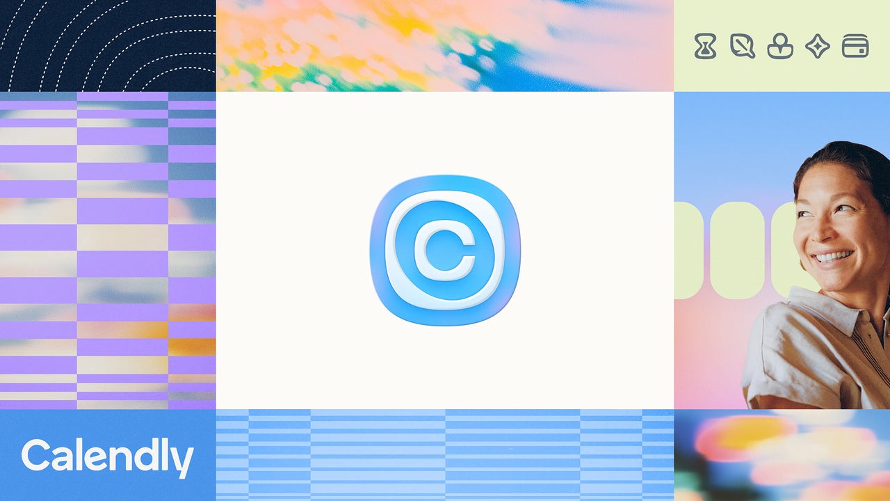
Calendly has undergone a significant rebranding effort to position itself as more than just a calendar in the age of artificial intelligence. The meeting software company announced a new logo, wordmark, color system, and brand positioning, created by design studio Smith & Diction. Alongside the redesign, Calendly revealed its expansion into AI-powered productivity tools, including an email assistant and meeting notetaker.
The rebranding comes as productivity software companies face the challenge of aligning their rapidly evolving capabilities with consumer expectations. Calendly's brand struggle includes its transition from a simple meeting scheduling tool to providing a suite of AI features. To address this, Calendly is shifting from a loud, bright brand identity to a softer, more understated look that communicates clarity.
Calendly's VP of brand and product marketing, Jamal Miller, emphasizes that users now expect tools that understand context, work across systems, and can take action when asked. This requires Calendly to define the unique value it provides in the AI era. Mike Smith, cofounder of Smith & Diction and lead designer for the rebrand, highlights the importance of a clear pitch to help users understand the core value proposition.
For Calendly, this is "making space for what matters," allowing users to focus on what truly matters in their day.
The new brand identity features a soft, organic aesthetic that aligns with Calendly's goal of simplicity and seamless integration into users' workflows. The color palette highlights the brand's core blue and incorporates prismatic pastels, symbolizing the "breath of fresh air" Calendly aims to bring to its users' daily lives. The design also incorporates "gloop," a recurring motif of liquid shapes that connects the various features of the platform, visually representing the invisible connection that powers everyday tasks.
Written by urgent.news from Fast Company's reporting — not their text. Machine-written — may contain errors; check the original before relying on it.